Recommend me a software for editing photos and creating new designs, please. Well, there are many different programs to work with graphics, a list of photo editing software you will find the link. The most popular software programs now are Adobe Photoshop, Corel Draw and Adobe Illustrator. Here you can download this software: download adobe photoshop cs5
Download CorelDRAW Graphics Suite X5 Download Illustrator CS4 I hope I helped you! Yes thanks, this information helped me a lot, I downloaded Adobe Photoshop and is very happy with it.

Archive for May, 2011

Think-and-Feel: The Fourth Level of Innovation

Sunday, May 29th, 2011

Experience is a four layer cake.  For example, experience with products and services is shaped by the interaction we have with them and how:

  1. 4-layer-cake.jpguseful they are (meet core needs)
  2. easy they are to use (usability)
  3. they delight the senses (sensory design)
  4. well they authentically move hearts and extend minds (cognitive design)

We use cognitive design to shape the fourth layer of the experience by creating interactions with a specific think-and-feel.   Market leading firms in every industry seek to differentiate their offerings with a think-and-feel and therefore compete through fourth level innovation.

drive_thru.pngTake for example, drive-thru service in quick serve restaurants.  Billions of dollars of food is served from the drive-thru windows at McDonalds, Taco Bell, Wendy’s and other fast-food or quick serve restaurants every year. Indeed, more money is made from drive-thru than the dinning room in the quick serve business.

Customers want fast and accurate drive-thru service. Market leaders have invested plenty in menu modifications, technology, lean, six sigma and other process excellence methods to insure customers get fast and accurate drive-thru experiences.

They have done the engineering to meet core needs (layer one). Ease of use is paramount and is achieved through clearly marked ordering lanes, readable order board displays and features such as price and order confirmation (layer two).  The sensory design can make or break the experience.  Speaker volume, digital displays, smell and an environment that appears clean and safe are a few examples (layer three).

But all of that is all table stakes (excuse the pun), as QSR magazine points out in their special report on the Drive-Thru Experience:

 “Customers tell us that the status quo is not OK anymore. They want a drive-thru experience that is positive and personal,” Del Taco’s director of operations Kevin Pope says.

That means doing cognitive design (layer four).  Some examples:

  1. Speaking casually during ordering to let customer drive the pace and tone
  2. Allow customers to enter their own orders through a digital pad
  3. Give out free dog biscuits to cars with dogs
  4. Use outside order takers with hand-held computers when lines get long

While these efforts are preliminary, they do signal that fourth level innovation is at work at the drive-thru. The question is, what type to think-and-feel do customers want?  

There has been a strong positive response to functionality that increases the level of customer control. Order and price confirmation and casual rather than structured ordering dialog are two examples.  Surveys have found that customers even want to enter their own orders on digital pads. Customers may be expressing the cognitive need for more comfortable control in the drive-thru process.  The idea is to allow customers to determine the level of control they want in the process so that they are psychologically comfortable.   

Sometimes it is important to know what they don’t want. One survey found:

When asked whether or not they wanted more entertainment from the quick serve while waiting in the drive-thru lane, all participants agreed that they were comfortable with sticking with their own devices. “

It would be interesting to know what people do as they sit in their cars in a drive up.  Do they worry or relax? Do they check emails and Facebook on their phone?  Is there some way to enhance or integrate what they are doing with the drive-thru experience?

Could this be an opportunity to positively encourage behavior change and select healthier items on the menu?

Share/Save/Bookmark

Communicating Unthinkable Things

Friday, May 27th, 2011

numb.pngThe horror and numbers involved in acts of genocide should cause outrage, compassion and action but often don’t.  And this appears to be true for other forms of unthinkably bad news that impacts large groups of people such as public health issues or industry-wide safety problems.

This phenomenon, called psychic numbing, is important for anyone designing communications that involve bad news at a large-scale. There are strong cognitive biases involved.  A nice summary is provided by J.E. Robertson in his post, Why Does Mass Suffering Cause Mass Indifference:

“The lone photo, with no information and no statistics, will spark great compassion. Adding statistics or removing the photo, or naming numbers that run into the millions, will lessen the likelihood of compassion across a large population. But when enough information is given so that the reader/viewer can comprehend in intellectually resilient terms the scale of a tragic crisis, the real energy of compassion is again motivated, perhaps more effectively than by any other means.”

While these claims are grounded in research, more research is required to explore the psychology of processing bad news about large numbers of people. Fortunately, these preliminary findings  offer designable insights. We can test and refine them through the communications we create as cognitive designers.

Share/Save/Bookmark

Is Knowledge Hiding Killing your KM Program?

Monday, May 23rd, 2011

who-me.jpgFor most organizations knowledge management (KM) means trying to get employees to share knowledge amongst each other or for codification into an on-line repository. By one report, firms spent $70 billion dollars on KM systems in 2008. A huge investment in knowledge sharing with little to no return. The reason? Generally employees don’t want to share knowledge, or if they do they have already figured out how to do it.

This issue is explored rigorously for the first time (as far as I know), in a just published article in the Journal of Organizational Behavior on Knowledge Hiding in Organizations. The researchers found that employees tended to engage in three modes of knowledge hiding including evasive hiding, rationalized hiding and playing dumb.  While engaging in knowledge hiding is driven principally by mistrust there are individual and organizational psychographic factors involved as well.

The prevalence of knowledge hiding despite a huge technology investment to the contrary signals that we cannot ignore the underlying cognitive psychology of knowledge work if we want to create value with KM.

It is time to step back from our technologically-driven and psychologically oversimplified approaches to KM and ask – what is knowledge and how can we manage it based on how minds really work?  KM needs a good dose of cognitive design STAT.

Share/Save/Bookmark

Wanted: Designs that Keep us from Going Mad!

Friday, May 20th, 2011

dark-side.jpgOn the cognitive design blog we usually talk about ways to create irresistible think-and-feel-experiences, facilitate behavior change, crank up knowledge-intensive performances or deliver mind moving communications.  But there is a darker side.  The lack of doing good cognitive design combined with the tremendous mental stresses of modern life contribute to many problems. These range from wasting mental energy to making poor decisions and failures to self-regulate behavior to more serious and clinical mental health issues.

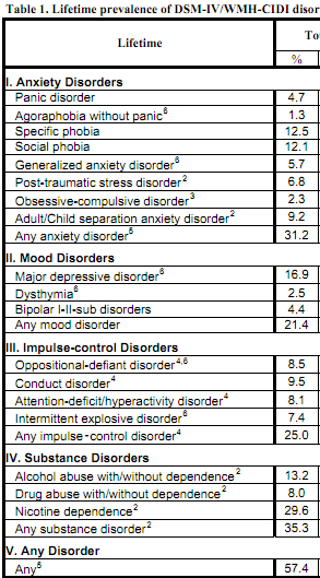
How much of a design-related issue is mental health and how big is the problem?  To begin to understand the scale of the problem check out Richard McNally’s new book What is Mental Illness? In it he argues that mental illness is an epidemic:

 ”Nearly 50 percent of Americans have been mentally ill at some point in their lives, and more than a quarter have suffered from mental illness in the past twelve months. Madness, it seems, is rampant in America.”

The study behind this claim can be found here and reveals the nature of the problems including anxiety, mood, impulse-control and substance abuse disorders.  

mental_health.png

While the foundation for addressing these challenges should rest on evidence-based practice from behavioral medicine, design has an important role to play.  We know this to be true from other healthcare examples. Medicine creates drugs and treatments to cure a wide range of problems but lack of compliance and adherence runs rampant because the way they are delivered is not designed for how the patient’s mind work.   My hypothesis is that the effectiveness of programs designed to maintain and restored mental health are even more sensitive to cognitive factors.

We hardly speak of mental health let alone design broad-scale programs to protect it. Interestingly, this is not the case when it comes to brain health or protecting our selves from age related cognitive decline, dementia, Alzheimer’s and other neurodegenerative diseases.   For example, check out the CDC’s Healthy Brain Initiative.

Given the scale of the problem, there is a wealth of opportunity for cognitive designers interested in creating programs to protect and restore mental health. Prevention is a natural place to start.  As that will no doubt entail behavior change, it might be possible to make small adjustment to ”mental health proof” other behavior change and wellness programs. Now that would be good design.

Share/Save/Bookmark

Feed the Pig Before You go Broke!

Wednesday, May 18th, 2011

feed_the_pig.pngWe are clearly a nation of spenders not savers in the US. You can see that at both the national level (current federal debt = $14.7 Trillion) and the individual level (total personal debt = $16.7 Trillion).   Our total debt (federal, state, local, household) is some 55.7 Trillion dollars! At the individual level this is primarily a behavior change challenge. I need to spend less and save more. It is very similar to losing weight. I need to eat less and be more active.

Consciously changing behaviors takes a lot of effort. We must learn what works from experience. This means trying a lot of small experiments with ideas that have proven practical for others.   We must fail many times before unlocking the simple tactics that work for our specific circumstances. Learning to change behaviors from experience is a major cognitive design challenge. One way to meet that challenge is to be sure to provide a fresh supply of small steps that aspiring changers can try.  Each step should be an easy but potent way of experimenting with the desired new habits.

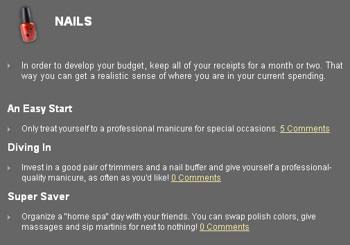
A good example is the attempt by the American Institute of Certified Public Accounts to help us develop the saving habit. They created a website called Feed the Pig  that includes a section on savings tips. These tips cover everything from buying makeup to dining out and using premium cable. Note how they are structured:

 nails.png

Each tip offers three experiments you can try.  This is a good way to stimulate the personal learning from experience that is so essential for effective behavior change.

Share/Save/Bookmark

$10M Prize for Cognitive Engineering & Design

Monday, May 16th, 2011

x_prize.pngIn many ways, the X Prize sits at the top of the heap when it comes to prize-based open innovation.  Anyone can enter, they offer large prizes (typically $10M) and are framed to create breakthroughs in important areas.  X Prizes have been won for creating super efficient cars and getting people into orbit and back safely. Right now there is a lot of buzz as 29 teams officially compete for Google’s $30M Lunar X prize. The goal is to send a robot to the moon that can travel at least 500 meters on the surface and send data, including images, back to Earth.

tricorder.pngX prizes present serious scientific and engineering challenges.  Cognitive engineering and design typically do not play a key role. Until now. Qualcomm and the X prize foundation just announce the $10M Tricorder X Prize.   The goal and naming of the prize is inspired by the Tricorder, a hand-held device on the series Star Trek that quickly figures out what injury or medical problem you have.

To win the Tricorder X Prize, a team will need to demonstrate a mobile device that can ”diagnose patients better than or equal to a panel of board certified physicians”.  It will also advise consumers on the next steps including the need to seek professional help. Meeting this challenge requires not only significant hardware and software engineering but cognitive engineering and design as well.  

Success turns on understanding the knowledge and cognition of  medical diagnoses and using technology to automate and maintain it.  

This is a hard artificial intelligence and expert system problem.  Furthermore, doing medical diagnosis on a mobile device in a way that will be accepted by consumers acting on their own presents a serious cognitive design challenge.

The prize is in the design phase. This means it is not yet officially funded. It will be further defined this year and if Qualcomm decides to, it will be funded and launched in 2012.   I strongly encourage readers of this blog to contact Qualcomm and the X prize Foundation and encourage them to move forward.

Share/Save/Bookmark

Teach Using Cognitive Design to Double Learning

Saturday, May 14th, 2011

student-teams.jpgLearning and teaching are clear cases of activities that very much depend on how our minds work. You would expected cognitive design efforts to reign supreme in education and training. Interestingly, applying the latest thinking in cognitive science and neuroscience to pedagogy and facilitating student and employee learning has not really gotten much traction.  So I am always on the lookout for studies that demonstrate its value.

Take for example, the recent study conducted at the University of British Columbia on the use of interactive teaching methods versus the traditional lecture model in undergraduate physics. They found students that experienced the interactive teaching methods scored twice as high on an exam that tests for understanding of complex physics concepts. In addition, the course using interactive methods had 20% better attendance.

 “There is overwhelming evidence how much teaching pedagogy based on cognitive psychology and education research can improve science education,” says co-author Carl Wieman. “

Interactive methods are simple and well known. They include techniques

“… such as paired and small-group discussions and active learning tasks, which included the use of remote-control “clickers” to provide feedback for in-class questions. Pre-class reading assignments and quizzes were also given to ensure students were prepared to discuss course material upon arrival in class.”

Such techniques are far more congruent with how minds work when learning new material as compared to the sit-and-listen mode in lectures. Clearly this just scratches the surface of what we can do to optimize educational services for how minds really work.

Share/Save/Bookmark

Designs that Fool our Brains

Wednesday, May 11th, 2011

Cognitive designs emphasize features and functions that put us in a particular frame of mind. The goal is to use interaction to create specific perceptions, thoughts, feelings and action propensities in anyone that comes in contact with the design.  In short, strong cognitive designs create a distinctive think-and-feel experience.

illusion.pngOne example of a distinctive think-and-feel is illusion or putting us in the frame of mind to believe something about the world that is not true.  For some excellent examples check out the finalists in the 2011 Best Illusions of the Year Contest.  I especially like Silencing Awareness by Background Motion (shown).

Click on the image and go watch the video. Did the dots seem to stop changing color when the object rotated? If so, you experienced an illusion. Watch the video again only this time stare at a single dot. Watch closely as the object rotates and you will see that the dot continues to change color.   Once you see it the illusion will fail to work.

Share/Save/Bookmark

Does Your Design Waste Mental Energy?

Sunday, May 8th, 2011

energy-brain.jpgHow much mental work can you do in one sitting? Are you motivated to tackle tough intellectual or emotional issues? Do you feel mentally invigorated or foggy? Each of these questions tests your level of mental energy. Mental energy is the fuel for self control, active reflection, conscious thinking and other executive cognitive functions. It is an important resource and one we need to manage carefully as we design workflows, consumer experiences, organizational change programs and other knowledge-intensive interactions.

So I am always on the lookout for scientific studies that directly probe the nature of mental energy. Take for example the new research, Being of Two Minds: Switching Mindsets exhausts self-regulatory resources.

“Across five experiments we found support for the hypothesis that switching mindsets is an executive function that consumes self-regulatory resources and therefore renders people relatively unsuccessful in their self-regulatory endeavors. The current studies found converging effects across a wide range of mindset operationalizations”

A mindset like a mental model is a set of general purpose cognitive constructs and procedures we boot up often in response to situational queues that guide how we perceive, think, feel, decide and act.  

Avoid switching mindsets to conserve mental energy.

Although a simple idea, it has powerful implications for the cognitive designer.  As you design seek to minimize the number of mindset shifts that must occur during interaction. Designs that invoke a single low-load mindset avoid wasting mental energy.

Share/Save/Bookmark

Optimized for Psychological Moments of Truth

Thursday, May 5th, 2011

mot.jpgGood cognitive designs pay particular attention (by dedicating features and functions) to psychological moments of truth (PMOT) in the customer experience. Casinos that use real time analytics to know when a high-value gambler is just getting ready to leave the table or a behavior change program that includes a “call your buddy” option when you are nearing relapse are two service designs focused on PMOT. These go far beyond the traditional PMOT of making a good first impression that many designs focus on. Product and service interactions are loaded with PMOT.

Anytime you have a strong emotional reaction (e.g. we often hear I love my phone, I hate my insurance company and performance evaluations are a pain) you are experiencing a PMOT success or failure.  Products or services that directly involve cognition – education, healthcare behavior change, decision support at work – are dominated by PMOT.  These psychological moments of truth are not nice-to-haves or frosting on the service cake, they involve fundamentally important outcomes.

Take for example the need for watchful waiting in healthcare. Patients and clinicians can deal with symptoms that may be best resolved by careful watching versus prescriptions, expensive tests or trips to the emergence room. Yet patients are fearful and clinicians may feel the need to practice defensive medicine.   When the emotional stress hits the decision making process we have a psychological moment of truth.  Combine that with the cost of care being diffused by a third party and a fee for service model that links not waiting with making money and the PMOT becomes even more intense.  We are not dealing with this very well. The result of not adequately supporting the cognition of watchful waiting is a major cost and quality driver in the US healthcare system.

Share/Save/Bookmark