The Zaltman’s have a new book out, Marketing Metaphoria, on the role of metaphors in marketing.
This is a valuable book for cognitive designers as they share the 7 most common “deep metaphors” they have found at work in the mind of customers around the global (12,000 interviews, 110+ clients, 30+ countries). As we have discussed elsewhere in this blog, metaphors play a basic role in how we perceive, think and feel about the world. They are both a window into unmet cognitive needs and a technique for developing more effective designs. Understanding the deep metaphors at work in a domain is a pre-requisite to design for how minds work. The seven include:
1. Balance “feeling centered”
2. Transformation “turning over a new leaf”
3. Journey “stay on track” or “it is downhill from here”
4. Container “I am in shape” or “it makes me feel empty inside”
5. Connection “she keeps in me the loop”
6. Resource “my computer is my bread and butter”
7. Control “it is out of our hands now”
Other core metaphors they have found include motion, force, nature and system, but at least one of the seven above always seem to be at play by itself or blended with others.
Uncovering metaphors is essential for designing how minds work. The book has many examples. My favorite concerns the work done at Oticon an international hearing aids company. Their research showed that nearly 80% of the hearing impaired refused to wear hearing aids. A study of deep metaphors showed that consumers were thinking about hearing aids using the container, connection and transformation metaphors. What consumers wanted want are hearing aids that transformed them from feeling flawed to being closer to their ideal and that “opened up” a whole new world (container).
This gave Oticon the insights needed to driver two themes including “transform from flawed to attractive” and “escape from entrapment”. These themes shaped adversiting and even led to the redesign of some product features.
In this case, the metaphors reveal the frame of mind consumers needed to have to use the functionality of the hearing aid. They need to feel “attractive and liberated” while wearing hearing aids. This is my favorite example because it illustrates, especially with artifacts that involve behavior change, that designing for a “think and feel” is not just icing on the cake but can be essential for getting the value out of the core functionality of the product. Remember, without achieving the proper frame of mind, 80% of the hearing impaired will not use a hearing aid.

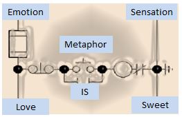 Take for example the article, What do love and jealously taste like? just published in the journal Emotion. Interestingly, the researchers found that those primed for the emotion of love reported that water tasted sweeter than normal or when they are primed for another emotion such as jealously or happiness. This provides some evidence that the metaphor “Love is sweet” impacts our perception of taste. Another case of expectations and psychology shaping senses and physiology.