Recommend me a software for editing photos and creating new designs, please. Well, there are many different programs to work with graphics, a list of photo editing software you will find the link. The most popular software programs now are Adobe Photoshop, Corel Draw and Adobe Illustrator. Here you can download this software: download adobe photoshop cs5
Download CorelDRAW Graphics Suite X5 Download Illustrator CS4 I hope I helped you! Yes thanks, this information helped me a lot, I downloaded Adobe Photoshop and is very happy with it.

Archive for February, 2008

Measuring and Designing Emotions

Tuesday, February 26th, 2008

Pieter Desmet has done important work on modeling product emotions.  A few key ideas from his work:

·        Product experience is made up of three components including aesthetic pleasure, attribution of meaning, and emotional response (follows Hekkert)

·        Individual differences in emotional response to products cannot be explained by age or gender but more by culture (Dutch, Japanese and US were compared in his dissertation) 

·        Individual’s emotional responses to products vary but the process of eliciting emotions is universal so you need to understand context (goals, standards, attitudes of users)

He has developed and successfully used a tool for measuring emotional reactions that queues on 14 different states including: 

Unpleasant: Indignation, Contempt, Disgust, Unpleasant surprise, Dissatisfaction, Disappointment, Boredom and Pleasant: Desire, Pleasant surprise, Inspiration,  Amusement,  Admiration, Satisfaction, Fascination.

Feedback is collected via the use of cartoon/icon expressions of the emotion and reports that you have, somewhat have or do not have that emotion when interacting with the product.

 linkpremo1001.jpg

This is one of the few research-based and field tested tools for designing emotions that I have found.  Watch for a review of his book, Designing Emotions, in this blog later in the year.


Share/Save/Bookmark

Cognitive Design of PowerPoint Slides

Friday, February 22nd, 2008

You no doubt have read Tuft’s position on the cognitive style of PowerPoint.  Now a heavy-weight cognitive scientist offers us four rules for doing better.  “Harvard cognitive scientist Stephen M. Kosslyn, who studies how brains process images, wants to improve the world with his cutting-edge research. And he’s starting with four ways to make your PowerPoint presentations more human brain-compliant”

For more click here.

Share/Save/Bookmark

Designing Exercise Equipment for Your Brain

Sunday, February 17th, 2008


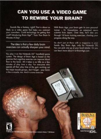
Many applications in cognitive design involve “juicing up” existing artifacts so that they have greater sensorial, affective, mental or psychological impact. Rarely do we get the chance to design artifacts whose sole purpose is to enhance and support cognition. An example of a “pure play” cognitive design is the rapidly growing area of brain training. These programs and devices aim to improve the memory, attention, perception and other cognitive functions (for aging baby boomers) by engaging us in simple and repetitious mental exercises.


The marketing is growing. According to experts at the Emerging Brain Fitness Software Market: Building Better Brains, the  US market in 2007 was $225M, over twice what it was in 2005.    The leading vendor, Nintendo has shipped some 15 million units of its popular Brain Age and Brain Training games.


  brain-training.jpg


There is evidence that some BUT NOT ALL of the programs do in fact produce short-term improvements after weeks of training.  However claims of longer term overall “brain health” improvements are still circumstantial.

Brain training promises to be a real proving ground for cognitve designers. We will track the developments closely in this blog.

Share/Save/Bookmark

Coporate Policies that Please the Mind

Wednesday, February 13th, 2008


I recently gave a talk to a group of HR/OD professionals at a Fortune 200 company on what cognitive design can do to enhance organizational effectiveness. One topic that really caught fire was how to redesign (from a cognitive perspective) the HR and management policies in large organizations. As organizations mature policies that are put into place (on how to make decisions and what behaviors are appropriate) can easily evolve into a web of rules, revisions and exceptions that borders on the complexity of the  U.S. tax code.  In such cases the policies create a massive cognitive load on the organization.  Non-compliance, decision errors and unintended consequences can be common place.  On the other hand, a well designed set of policies can make a fundamental contribution to the profitability and competitiveness of the firm.


Cognitive designers can help by emphasizing policies that:

  1. Can be applied in a way that fit how managers and employees think (low cognitive load)

  2. Safeguard against cognitive biases in managerial decision making

  3. Naturally reflect the principles at work in the culture.


Expanding on the first point, policies that fit the way people think typically:

  • * Provide examples that contain the answers to the most frequently encountered case – this lets me “blink” or reason by pattern matching.

  • * Are resolved by “one good reason” – this lets me make single factor decision the simplest decision heuristic.

  • * Invoke sequential reasoning or “rules of thumb” applied in a specific order – this lets me take a cookbook approach and avoid complex branching logic that overloads.

  • * Use prioritized and binary branching logic – this lets me work through a complex decision space in otherwise  fast and frugal” way by answering yes/no questions with the important ones asked first.


These guidelines, based on the last 20 years of research in naturalistic decision-making,  represent increasing degrees of cognitive load including, blinking (no thinking), single rule reaction (little thinking or no thinking), sequential reasoning (little thinking if rules are simple and have a natural order) to more complex decision making.   


The rules-of-the-road for making decisions at a traffic intersection is a good example of a single reason sequential decision making design. You know the story – if a policeman is directing traffic you follow their hand signs. Baring that and given a traffic light you obey that. Absence direction by a policeman, traffic light (or sign) the first person to the intersection has the right-of-way and so on.   All the rules are based on a single factor and are executed in sequence. It would be easy to overcomplicate the situation and design policies for age of the driver, size or type of vehicle, time of day and an endless series of other important sounding variables.  The result would be a lot more accidents and delays.


The rules-of-the-road example also illustrates how policies can reflect principles at work – in this case by respecting authority and being courteous. Linking policy to values (aka principles) in a natural way increases alignment and lowers cognitive load even further.


These cognitive design guidelines can be applied to the development of any type of policies or rules meant to shape behavior and decision-making. They don’t tell you what the policy should say but instead emphasize how it should be said (structured) to make sure they fit with the way our minds work. A body of policies or rules is an artifact that should be designed to support and enhance cognition.

Share/Save/Bookmark

Music You Cannot Forget (Literally)

Monday, February 11th, 2008

  Music activates cognition in very powerful ways. It can enhance creativity.  It has long been used as an accelerated learning technique. It invokes memories, stimulates daydreaming and certain songs even become lodged in your head.  Songs that get caught in your head are called “earworms” (yikes). Metaphorically, an earworm is like a biochemical that causes a cognitive itch that you scratch by repeating the song in your head (or even out loud). Of course, the more you scratch the more you itch and the thing gets deeply embedded in your brain. Examples that turn up in the studies include: Who Let the Dogs Out, Queen’s We Will Rock You!, The Mission Impossible Theme and It’s a Small World After All.  

Despite the recent rise of the field of “music cognition” including its own professional societies, journals, academic research labs and PhD programs, little is known about the cognition of earworms.  However, “According to research conducted by University of Cincinnati professor James Kellaris, virtual any song can become an earworm. However, songs that are simple, repetitive, and contain some incongruity – an unexpected twist – are most likely to become stuck.” It’s important to note that the entire song does not get stuck just 10-15 seconds of it. Also songs with lyrics seem to be stronger earworms.

Short, easy-to-repeat and something with a twist – sounds like an idea virus, only one you keep passing to yourself instead of to someone else.  

I have not found anyone claiming they can engineer earworms but there is one company, Earworms Publishing – musical brain trainer, that claims to be using them to help your learn a second language.  I don’t know if their earworm language learning method actually works but it does seem popular.  Their module on Spanish was in the top five iTunes Best Sellers for 2007.

Share/Save/Bookmark

Designing for the Emotions that Pay the Most

Friday, February 8th, 2008

 One question I get about cognitive design is what emotions or mental states should we design for? Should we create service experiences and products that generate pleasure, humor, pride or what?  Of course the answer depends up your goal. Are you designing for customer retention, premium pricing, brand extension or some other impact? Same thing on the employee side – are you designing for retention, improved productivity or quality, increased risk-taking or some other impact? Unfortunately, there is not a lot of research that links mental states to improved business outcomes. There is however some sweet pockets of it, especially in the area of emotional satisfaction.  Check out the work of the folks at Gallup on a concept they call Human Sigma.

They advocate using six sigma principles (systematic data oriented approach to improving the performance of a given metric) to measuring and managing the interaction between employees and customers. They have found that “emotionally satisfied” customers are what counts and to get that you need to engage both employees and customers. They measure (numerically) this combination of customer and employee engagement in what is called the Human Sigma score.  

For example, on the customer side they have isolated the following elements that describe the “emotional nature of the customer’s commitment”  

Confidence – Are the people competent, does the company deliver on its promises?

Integrity – Am I treated the way I should be? If something goes wrong is it fixed?

Pride – positive identification with the company

Passion – is this a company I cannot live with out, is it the perfect fit for me? 

Organizations that score in the upper 20% of customer engagement get a 23% premium in wallet share, profitability and revenue.

This is a huge advantage and gives the cognitive designer strong guidance on what kind of mental states to focus on.


If you combine employee engagement with customer engagement you get business units that are 3.4 times more financially effective (as measured by total sales and revenue; performance to target and year-over-year gain in sales and revenue). 


Being a six-sigma black belt and cognitive designer I am very interested in learning more about Human Sigma.  I will blog my findings but in the meantime you can get free access to an HBR article on Human Sigma, visit the Gallup Management Journal or buy the book.

Share/Save/Bookmark

Using Cognitive Design in the War for Talent

Wednesday, February 6th, 2008

Cognitive designers envision products and services that enhance the thinking, emotions and other mental states of customers. They do the same for employees. That is, cognitive designers envision HR/employee programs, management policies, processes, workspaces, teams and other “organizational artifacts” that win the hearts, minds and mental states of employees.  

So you can do cognitive design outside the firewall or inside the firewall. A good example of cognitive design inside the firewall (focus on employee cognition for the purposes of organizational improvement) can be found in a recent article on Leading Clever People. The authors Rob Goffee and Gareth Jones, two business school professors, point out that clever (smart and creative) people are essential for success in today’s economy but they don’t respond well to the traditional leadership model. So they conducted interviews to find out why.  

“What they learned is that the psychological relationships effective leaders have with their clever people are very different from the ones they have with traditional followers.” 

Furthermore, they found that clever people have specific cognitive needs (or characteristics) that include: 

Bore easily, value intellectual over positional status, understand their worth is based on tacit skills, expect instant access to top management as confirmation of the value of their work, ignore hierarchy, will gravitate to where their work is most appreciated and generously funded.   

To support this type of employee cognition they offer the following design: 

 “The trick is to act like a benevolent guardian: to grant them the respect and recognition they demand, protect them from organizational rules and politics, and give them room to pursue private efforts and even to fail. The payoff will be a flourishing crop of creative minds that will enrich your whole organization.”  

Some would argue that this is catering to an elite but it applies equally well to all type of employees it is just that “the trick” will be different.  In Northwestern’s Master’s Program in Learning and Organization Change, we hit this point hard arguing that one of the main things that makes cognitive design important today is that talented employees demand a workplace that reflects it.   It is up to managers and leaders to understand the cognitive needs of employees and design HR/employee programs and management practices to meet them. Professors Goffee and Jones gave us a great example of how to do that. One that illustrates that understanding the cognitive needs of employees is not rocket science. They did not have to do a brain scanning study or do cognitive task analysis. All they did was look and ask.

Share/Save/Bookmark

Can Cognitive Design Drive Service Innovation?

Tuesday, February 5th, 2008

                                                                                                           We live in an economy where most of the value is created by services not goods. That’s why there is a big push on to develop a new discipline of service science, management and engineering.  The other reason is that we don’t know much about services.  Unlike products, they are intangible, experience-based and operate on different rules.  The areas of service design and service innovation are buzzing.  Cognitive design will play a key role in services innovation and we will chronicle that closely in this blog.    As way of an example, check out Jeanne Rae’s recent article Seek the Magic of Service PrototypesSome key points: 

  • “Studies show that people gravitate toward products and services that make them feel good, safe, calm, or happy”

  • Rather than defining a service by what it does, think of it as the reaction it elicits from the people using it.”

  • “Good service prototypes appeal to the emotions and avoid drawing attention to features, costs, and applications that can clutter the conversation and derail the excitement factor. Storytelling, vignettes, cartoons, amateur videos—all are low-budget tools that bypass the intellectual “gristmill” and go straight to the heart.”  

This approach clearly puts designing for mental states on equal or even more important footing than designing for  the core functionality/features of the offering. That is what cognitive design is all about!

Share/Save/Bookmark

Savoring: Designs that go from Good to Great

Saturday, February 2nd, 2008

Just finished work with a client who is a big believer in cognitive design. They have done a great job using the latest ideas in cognitive science to design a truly positive service experience for their customers. But he wants to do more, much more. The question he asked was how can I go from a positive experience to something truly great using cognitive design?

We looked at a lot of things but decided to make use of recent insights into to the cognition of savoring. Ask yourself, when was the last time your really savored a positive experience – luxuriating in a pleasure, basking in a moment of pride, truly giving thanks or marveling at something that is just awesome?  Savoring is an important cognitive process (essentially for happiness and optimal functioning) that, according to Fred B. Bryant, a professor of psychology at the Loyola University, involves “attending to, appreciating and enhancing the positive experiences in life”.  For more check out his latest book, Savoring a New Model of Positive Experience.  It is a treasure trove for the cognitive designer!

The central design question became what features and functionality could we add to the service to help customers perceive, appreciate and amplify the positive experience they were already having? Of course, we had to first decide which specific mental state (or underlying emotion) – pleasure, pride, gratitude or awe fit the service.  

The “perceive and appreciate” part came down to helping customers block out the rest of the world and really relax.  Often we fail to savior life’s experiences because we are too hurried, worried about the future or just plain tired. As a designer, ask yourself what features and functions can you add that will get rid of the noise and momentarily suspend the pressures of everyday life.  Sometimes just promising the right thing can invoke user memories supporting that. Remember the “Calgon take me away commercials”?  

Once focused users will need to help amplifying the positive experience to take pleasure to luxuriating, pride to basking and so on.  Tactics for doing this include anticipating the positive experience, prolonging the positive experience or having ways to relive it once you are done. Anticipation, time extensions and reliving all amplify and if done right allow us to savor a positive experience. We often do this naturally by telling friends and family about our plans (anticipation) and the details of a positive experience (reliving). Providing features and functions that support the telling of a positive experience can lead to savoring.  Allowing user to hit “instant replay” or “more like this” or otherwise elongate the experience (e.g. intentionally delays in staging a multi-course meal) can also induce savoring.   

Savoring is not just for luxury brands and high-end services. Think about lottery tickets. Wins (even small ones) are retold many times and recounted with pride that can safely be described as basking.  The anticipation of a future positive experience they create is very intense and the “hope of wining big” is a luxuriating experience for many.  

No matter, savoring is a distinct mental state that we can target as designers. Interestingly, according to Professor Bryant, it only comes in four flavors – luxuriating, basking, thanksgiving and marveling.

Share/Save/Bookmark

Adding Game Features to Your Design

Friday, February 1st, 2008

 In an earlier post I talked about reverse engineering things that make our minds race as a technique for doing cognitive design. I highlighted an article from Wired that talked about how the game model is being applied to the design of many different things. Now Businessweek has picked up on the issue with an article titled:

Rules of the Game: Funware brings gaming features to consumer applications like photo-sharing and social networking.

One example:   “PhotoAttack, you must quickly describe images as they fly at you. “Funny,” “cute,” “sexy,”—and so on. The more your tags match those of other users, the higher your score. You can invite friends to play the game with your images, though you can also choose who views what—and tags can later be exported to other photo-sharing sites. As the game is played again and again by users, the quality of each tag improves.”

Note the clever use of both game features and collaborative tagging (folksonomy style) to help solve the problem of organizing large online stores of photos. Not clear if it will work yet but it seems like a very clever cognitive design. If you are struggling with the cognition of organizing your photos give it a try at rmbr (when they are done with beta testing).

Share/Save/Bookmark