Recommend me a software for editing photos and creating new designs, please. Well, there are many different programs to work with graphics, a list of photo editing software you will find the link. The most popular software programs now are Adobe Photoshop, Corel Draw and Adobe Illustrator. Here you can download this software: download adobe photoshop cs5
Download CorelDRAW Graphics Suite X5 Download Illustrator CS4 I hope I helped you! Yes thanks, this information helped me a lot, I downloaded Adobe Photoshop and is very happy with it.

Archive for the ‘Books’ Category

Making Meaning By Design

Thursday, July 24th, 2008

Making meaning – how do customers and employees do it and how can we design artifacts that support the creation and experience of it? 

An artifact or natural object becomes meaningful when I classify it or put it in a category.  For example, I look at (and perhaps even smell) something moving in a field and pattern recognize it as a cow. The “something” now categorized as a cow has considerable meaning because I believe, feel, value and perhaps even know a lot about cows. I was able to categorize it because I perceived that it had a form, specific features (or properties) and behaved (or functioned) in a particular way. These 3Fs – form, features and functions matched my category, schema or mental model of a cow.   That is general or public meaning.

There is also personal meaning that is created when the category is one that is particularly important to me because it reflects my values or meets a cognitive (intellectual, affective, motivational, volitional) need that I have. Continuing with the cow example,  we have seen a consumer crazy with cow toys, stuff animals, collectibles, pottery, pictures,  gifts, t-shirts and the like appearing. For marketing fans there is also the famous “Purple Cow” created by Seth Godin by his book by that title.  
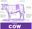
purple-cow.gif

Why the consumer fascination with cows? What personalized meaning is being created? What previously unmet cognitive need is being satisfied?  

I raised these questions last year with a group I was training in a large corporation in the food industry.  They went out and analyzed cow artifacts and developed psychographic profiles for people that were consuming them. The psychographic profiles are like socio-economic profiles only instead of focusing of where you live and how much you make they focus on how you think, learn, make decisions, emotionally react and other key aspects of your cognition.

I cannot share the specifics of what they found but in general terms they found cow symbols creating personalized meaning because, for example, cows are big but lovable, a part of the great American west, the subject of many jokes, stories and a focus of concern for humane treatment.

  cow-small.jpg            cute_cow_tea_kettle-small.jpg

The Purple Cow was understood as a juxtaposition effect creating novelty and surprise – after all cows are not purple.   Point being that if we are going to design artifacts (experiences, products, corporate events, etc.) that create or enhance personalized meaning for customers and employees we need to understand the underlying psychographic profile we are trying to meet.  

In cognitive design, psychographics goes beyond values (what the user holds to be important) to include how they reason (e.g. are specific biases involved), how they structure the mental content (e.g. metaphors, archetypes, gestalts), what core beliefs or mental models are involved (especially if they are faulty), what types of emotional and other visceral responses are they prone to and a host of other factors. 

I contrast psychographics to a values-based approach to open the window a bit and get additional insight to guide the design process. For example, check out the 15 meanings (general profiles) that Steve Diller and his colleagues have documented from their research into meaningful customer experiences.

making-meaning-book.jpg

 The profiles include, for example, duty, freedom, truth, enlightenment, justice and oneness.  All value-based categories and if I know which of these are operating in my target market I have valuable insights for design.

Now imagine I can go a step further and determine that not only is “Justice”a key meaning maker for my users but that they understand it in terms of two core metaphors – journey and control (see my earlier post on Zaltman’s new book on deep metaphors). This provides even more design information to help me shape the 3Fs (form, features and functions) of the artifact to fit how the minds of my consumers or employees work.   

“Justice”  defined by Diller as a type of meaning is “The assurance of equitable and unbiased treatment”.  To be most effective in designing experiences based on this form of meaning we need to understand how user reason about justice – what is their calculus of equitable and unbiased?  I demonstrate the importance of this in an earlier post (designing for trust) that discusses service recovery.  Over compensation during service recovery can lead to consumer guilt, under compensation can lead to anger.

Meaning, especially personal meaning is created by a complex cognitive process that includes, values, emotions, metaphors, images, mental models, reasoning rules and the like.  To enhance or create meaningful experience for employees and customers we need to understand not only what values transform public meaning into private meaning but the mechanics of how that is done.

Share/Save/Bookmark

Designing for Sway

Wednesday, May 28th, 2008

  Cognitive biases are short-cut ways that we use to perceive the world, make decisions, solve problems and behave in social situations. They are rules of thumb for dealing with complex situations fast and effectively. Turns out that when we use them outside the area they are intended for (and we do this all the time) we make systematic errors. This is why we can look and behave so irrationally.    

Researchers have documented a wide array of cognitive biases. Check out the list of 100+  cognitive biases that Wikipedia has complied.  In cognitive design, since we are concerned with designing things for how minds work, we must understand which cognitive biases are at work in our application and how we plan to manage or paternalistically leverage them.

A classic example is the Save More Tomorrow pension plan that lets you save some portion of a future raise (rather than your current money) out of respect for our bias to undervalue future resources and over value current resources.  Turns out emphasizing what you currently have (a bird in the hand is worth to in the bush) is a great strategy except when it comes to savings. Vanguard Investments has taken this idea even further with their Autopilot 401k  savings plan that is designed to accommodate all the latest findings in behavioral finance.    

Cognitive biases are hot. Best selling or popular books focus on them – Freakonomics, Blink, Gut and many others.  A recent addition to this list that I just finished is Sway: The Irresistible Pull of Irrational Behavior.  The authors provide many detailed stories that illustrate three common biases including loss aversion (over valuing current resources), diagnosis bias (inability to rethink our initial assessment of something) and the chameleon effect (taking on the behaviors and properties that others have attributed to us).  I am recommending this book to designers as a good way to sharpen your instincts for detecting and dealing with cognitive biases as a constraint and sometimes enabler in the design process.

Share/Save/Bookmark

Deep Metaphors for Breakthrough Design Insights

Thursday, May 15th, 2008

The Zaltman’s have a new book out, Marketing Metaphoria, on the role of metaphors in marketing.

 This is a valuable book for cognitive designers as they share the 7 most common “deep metaphors” they have found at work in the mind of customers around the global (12,000 interviews, 110+ clients, 30+ countries). As we have discussed elsewhere in this blog, metaphors play a basic role in how we perceive, think and feel about the world. They are both a window into unmet cognitive needs and a technique for developing more effective designs.  Understanding the deep metaphors at work in a domain is a pre-requisite to design for how minds work. The seven include: 

1.  Balance “feeling centered”

2.  Transformation “turning over a new leaf”

3.  Journey “stay on track” or “it is downhill from here”

4.  Container “I am in shape” or “it makes me feel empty inside”

5.  Connection “she keeps in me the loop”

6.  Resource “my computer is my bread and butter”

7.  Control “it is out of our hands now”   

Other core metaphors they have found include motion, force, nature and system, but at least one of the seven above always seem to be at play by itself or blended with others.  

Uncovering metaphors is essential for designing how minds work. The book has many examples. My favorite concerns the work done at Oticon an international hearing aids company. Their research showed that nearly 80% of the hearing impaired refused to wear hearing aids. A study of deep metaphors showed that consumers were thinking about hearing aids using the container, connection and transformation metaphors. What consumers wanted want are hearing aids that transformed them from feeling flawed to being closer to their ideal and that “opened up” a whole new world (container).  

This gave Oticon the insights needed to driver two themes including “transform from flawed to attractive” and “escape from entrapment”. These themes shaped adversiting and even led to the redesign of some product features.

In this case, the metaphors reveal the frame of mind consumers needed to have to use the functionality of the hearing aid. They need to feel “attractive and liberated” while wearing hearing aids. This is my favorite example because it illustrates, especially with artifacts that involve behavior change, that designing for a “think and feel” is not just icing on the cake but can be essential for getting the value out of the core functionality of the product.  Remember, without achieving the proper frame of mind, 80% of the hearing impaired will not use a hearing aid.

Share/Save/Bookmark

Designing to Achieve an Extended State of Mind

Thursday, May 1st, 2008

  When we interact with an artifact (anything that has been designed) we can experience five distinct frames of mind including: agitation, tolerance, resonance, acceleration and integration.  So something either irritates me, bores me, really clicks with me, speeds up my thinking and emotions or literately makes the thoughts and emotions I am having possible in the first place.  This last state – integration, implies a profound coupling between the functionality of the artifact and the cognition of the user.  For example, a brain-computer interface may let me move a cursor on a computer screen by thought alone. Without the brain-computer interface (artifact) I cannot have the cognition to move the cursor on the computer screen. It is the two things working together in an integrated system that give rise to the cognition.  In this way, cognition is actually extended beyond the skull to include the artifact and aspects of the environment. 

 Designing to achieve this fifth or extended state of mind – integration between user and artifact – may seem exotic (how many of us use brain-computer interfaces) but an emerging position in the philosophy of mind argues it may be more common place than we think. 

   Andy Clark, a philosopher has an exciting new book coming out, Supersizing the Mind: Embodiment, Action and Cognitive Extension,  where he argues that certain forms of cognition are so entangled with artifacts in the environment that we need to think of mind as extended not “brain bound”.  That is the mind extends beyond the brain and the body into the environment by the way it is tightly coupled to objects and events.  For example, a scientist who uses pen and paper to write, think and develop insights into nature.  Pen and paper are far more mundane than brain-computer interfaces but in the rights hands may in fact generate an extended frame of mind.  

   In my cognitive design class I challenge students to come up with examples of how this extended state of mind works in our everyday world.  Common responses include thinking in the shower or while listening to music.  Does the flowing water or sound actually integrate with and extend cognition beyond the body?  I’m not sure but I hope Andy Clark’s new book will help me figure that out.  In the meantime,  I must agree with the publisher’s write up: 

The importance of this new perspective is profound. If our minds themselves can include aspects of our social and physical environments, then the kinds of social and physical environments we create can reconfigure our minds and our capacity for thought and reason.”

Share/Save/Bookmark

Cognitive Biases Sabotage Improvement Efforts

Wednesday, March 26th, 2008

 Cognitive biases are strong (some say hardwired) tendencies to process information, think or interact in ways that can (but don’t always) create systematic errors.  Well known cognitive biases include the confirmation bias (I seek out new information and ideas that support my current beliefs) and the halo effect (I tend to judge all aspects of something based up one or two dominate characteristics that overshadow the rest). There are dozens of interrelated biases that have been documented and many studies that illuminate them at work in how doctors think, investors make decisions, people chose mates, teams function (or not), managers hire employees, consumers make choices and many other domains.  

   Effective decision-making requires managing cognitive biases especially in high stakes situations.  This point was made vividly by Phil Rosenzweig in his recent book the Halo Effect  and the eight other business delusions that deceive managers.   The book highlights the role that cognitive biases and other systematic errors in thinking have played in our attempt to understand and improve the performance of organizations. He outlines nine such “delusions” about high performance organization, including the halo effect: 

   “The tendency to look at a company’s overall performance and make attributions about its culture, leadership, values and more. In fact, many things we commonly claim drive a company performance are simply attributions based on prior performance.” 

   Just as we have a bias to think that good looking people must be smart, have an interesting life, or be successful, we think high performing organizations must have strong cultures, good leaders or the right values.   He quickly dashes our hope that research could settle the question (Good to Great, In Search of Excellence, etc.) by arguing the professors and consultants that do the research fall prey to other types or errors in reasoning including for example, confusing cause and effect (or correlation and cause). So does employee satisfaction generate organizational performance or does organizational success generate employee satisfaction? We are often told the former when it fact some research shows the latter. This would mean our attempts to improve organizational performance by focusing on employee satisfaction (a popular thing to do) could be wrongheaded. This does not mean we don’t want to focus on employee satisfaction but doing so under the theory that it will drive organizational performance may be more of the halo effect, or confusing cause-and-effect than anything else.  

  If  Rosenzweig is right (I have seen all the delusions he quotes in action in many different circumstances) then our inability to manage cognitive bias has wrecked (or at least limited) our ability to improve our organizations through research and managerial will.

  We need a more detailed understanding of the role that cognitive biases play in organizational improvement and then we can use that understanding to “design against” them in our research and implementation work. 

Share/Save/Bookmark

Functionality –> Usability –> Mentality

Thursday, March 20th, 2008


Traditionally designers and human factor specialists are very focused on functionality and usability. We want things that are useful and easy to use.  As we move into the next century more and more designers are looking to go beyond usability concerns to the systematic design of pleasurable or enjoyable products. The idea is to design for specific states of mind (mentality) in the user – pleasure, enjoyment and so on.   


Two excellent books that take this approach include Designing Pleasurable Products  by Patrick Jordan and Funology: From Usability to Enjoyment edited by Mark A. Blythe and others. Both books represent important efforts to design for mentality (user’s state of mind). They borrow a little from the cognitive science (or related) literature and quickly develop practical tools and methods for doing design.  Although productive, neither book provides (or purports to provide) the systematic review of what we know about how minds work (cognitive/neuro sciences) to effectively make the following shift:

Functionality à Usability à Mentality


I use the word mentality rather than pleasure or enjoyment because it denotes that the design challenge may be broader – encompassing any state of mind that is needed to drive more value from the artifact. No matter which word you use there is an important shift from a word that describes the artifact (functional and usable) to one that describes the mental states of the user. This is consistent with a more human-centric approach to design. I am not just designing to meet the “needs of users”, instead I am designing a cognitive artifact that integrates both the functional state of the product and the mental state of the user in hopefully a fully symbiotic relationship. Another advantage of defining Mentality as the goal is that it can also refer to a state of the product/artifact as functionality and usability do. Mentality in a product/artifact means I am designing smarter machines and other artificially intelligent artifacts. As described in the post below, Donald Norman sees smarts machines designed to work symbiotically with humans as the future of design.


The next step in design then is to “design for mentality” in humans by achieving a specific state of mind and in the artifact by adding functionality that makes it smarter.  

Share/Save/Bookmark

The Design of Future Things

Monday, March 17th, 2008

Check out Donald Norman’s latest book, The Design of Future Things.  His basic thesis is that in the future the things we design will be smart (emotionally and intellectually) permitting a more natural form of interactions (one similar to a horse and rider) and even achieving a level of human-machine symbiosis. It is people and their artifacts working together – with machines augmenting the capabilities of humans that make up the design of future things. Homes, cars, workspaces, airports, robots and other artifacts will be designed to work with us at three levels including the visceral (automatic and unconscious responses), behavioral and reflective (conscious self awareness).

 He offers six rules for designers of these smart machines of the future: 

  1. Provide rich, complex and natural signals

  2. Be predictable

  3. Provide good conceptual models

  4. Make outputs understandable

  5. Provide continual awareness without annoyance

  6. Exploit natural mappings.

 Being predictable and running on a good conceptual model means I can understand (to a degree) the artifact’s workings, know how it will behave and also come to trust it especially since its outputs are understandable. Rich and natural signals that support my continued awareness of (and feedback about) its operation without annoyance makes it is an active part of my environment. These are many of the same things that make my interactions with other people work.  

 All of these rules effectively lower the cognitive load associated with the artifact without sacrificing functionality. There is a higher degree of integration between the functional states of the artifact and the mental states of the people using the artifact. Indeed, in the case of a symbiotic relationship they are fused together in a dynamic feedback loop.  This represent the fifth level of cognitive fit (1= agitate, 2 = tolerate, 3= resonate, 4 = accelerate and 5 = integrate) that we have discussed elsewhere in this blog.  

 One example Professor Norman gives is that of a Cobot being developed at the Laboratory for Intelligent Mechanical Systems at Northwestern. In this example, humans can move heavy payloads (e.g. automobile engines) in complex environment smoothly and easily by sharing control and intelligence with a robot.  The robot provides not just mechanical muscle but also brains by providing natural resistance to suggested motions that are not consistent with the task or could be unsafe.  All of this takes place NOT via a controller to manipulate a robot arm but by directly interacting with the artifact (e.g. by wrapping a chain around the automobile engine to lift it). This is consistent with rule #6 – exploit natural mappings.

 In a provocative afterwards, Professor Norman describes an imaginary interview he had with an intelligent machine about a set of design rules they (intelligent machines) developed to improve their interactions with people.  We will review those rules and their implications for cognitive design in a future post.

Share/Save/Bookmark

What Turns the Engine of Mass Collaboration?

Wednesday, March 5th, 2008


As mentioned in a previous post, peer production is an emerging model for highly-distributed knowledge work (making predictions, writing encyclopedias, developing software, etc.) that for the most part does not involve direct compensation (pay) and results in products/outputs that rival the very best that are created using traditional proprietary production models. Linux (software operating system), Wikipedia (encyclopedia), Flickr (photographs) and Second Life (objects for a virtual world that sell for real dollars) are popular examples.


What motivates knowledge workers to produce for no pay? This question is especially interesting when you look at open source development (talented software developers).  Very good research on this topic can be found in the year old MIT press book Perspectives on Free and Open Source Software edited by Joseph Feller and others.  The entire book is online and the first two chapters deal with a profiling and understanding the motivation of open source developers.  They identify eight possible motives that could explain why open source developers participate in a project including:


 Altruistic – this is a socially important, a way I can give back

Profit – way to make money

Fame – increase my stature in my peer group and perhaps the world

Marketability – signals my skill to the market

Utility – work with others to fix a problem I have

Enjoy – doing this is fun, like going to the movies or hiking

Development – this is like a free university or mentoring program

Ideological– all software should be free, help break monopolies

  They claim all are at work and provide a “big tent” embracing many needs.  A survey revealed that the primary motivation was creative expression (working on the most creative project in their career) and social interaction including learning and developing new skills, sharing knowledge and skills, participating in a new form of cooperation.  If software is your passion working in new ways on important/creative projects and getting to build your chops while helping others would likely be too much to pass up.

  The open software development model and other modes of peer production are excellent examples of how web-based mass collaborations can satisfy deep cognitive needs in talented knowledge workers. Satisfying cognitive needs (versus economic needs) is what turns the engine of peer production. This puts the cognitive designer in the cat bird seat when it comes to creating new peer production models.

Share/Save/Bookmark

Measuring and Designing Emotions

Tuesday, February 26th, 2008

Pieter Desmet has done important work on modeling product emotions.  A few key ideas from his work:

·        Product experience is made up of three components including aesthetic pleasure, attribution of meaning, and emotional response (follows Hekkert)

·        Individual differences in emotional response to products cannot be explained by age or gender but more by culture (Dutch, Japanese and US were compared in his dissertation) 

·        Individual’s emotional responses to products vary but the process of eliciting emotions is universal so you need to understand context (goals, standards, attitudes of users)

He has developed and successfully used a tool for measuring emotional reactions that queues on 14 different states including: 

Unpleasant: Indignation, Contempt, Disgust, Unpleasant surprise, Dissatisfaction, Disappointment, Boredom and Pleasant: Desire, Pleasant surprise, Inspiration,  Amusement,  Admiration, Satisfaction, Fascination.

Feedback is collected via the use of cartoon/icon expressions of the emotion and reports that you have, somewhat have or do not have that emotion when interacting with the product.

 linkpremo1001.jpg

This is one of the few research-based and field tested tools for designing emotions that I have found.  Watch for a review of his book, Designing Emotions, in this blog later in the year.


Share/Save/Bookmark

Savoring: Designs that go from Good to Great

Saturday, February 2nd, 2008

Just finished work with a client who is a big believer in cognitive design. They have done a great job using the latest ideas in cognitive science to design a truly positive service experience for their customers. But he wants to do more, much more. The question he asked was how can I go from a positive experience to something truly great using cognitive design?

We looked at a lot of things but decided to make use of recent insights into to the cognition of savoring. Ask yourself, when was the last time your really savored a positive experience – luxuriating in a pleasure, basking in a moment of pride, truly giving thanks or marveling at something that is just awesome?  Savoring is an important cognitive process (essentially for happiness and optimal functioning) that, according to Fred B. Bryant, a professor of psychology at the Loyola University, involves “attending to, appreciating and enhancing the positive experiences in life”.  For more check out his latest book, Savoring a New Model of Positive Experience.  It is a treasure trove for the cognitive designer!

The central design question became what features and functionality could we add to the service to help customers perceive, appreciate and amplify the positive experience they were already having? Of course, we had to first decide which specific mental state (or underlying emotion) – pleasure, pride, gratitude or awe fit the service.  

The “perceive and appreciate” part came down to helping customers block out the rest of the world and really relax.  Often we fail to savior life’s experiences because we are too hurried, worried about the future or just plain tired. As a designer, ask yourself what features and functions can you add that will get rid of the noise and momentarily suspend the pressures of everyday life.  Sometimes just promising the right thing can invoke user memories supporting that. Remember the “Calgon take me away commercials”?  

Once focused users will need to help amplifying the positive experience to take pleasure to luxuriating, pride to basking and so on.  Tactics for doing this include anticipating the positive experience, prolonging the positive experience or having ways to relive it once you are done. Anticipation, time extensions and reliving all amplify and if done right allow us to savor a positive experience. We often do this naturally by telling friends and family about our plans (anticipation) and the details of a positive experience (reliving). Providing features and functions that support the telling of a positive experience can lead to savoring.  Allowing user to hit “instant replay” or “more like this” or otherwise elongate the experience (e.g. intentionally delays in staging a multi-course meal) can also induce savoring.   

Savoring is not just for luxury brands and high-end services. Think about lottery tickets. Wins (even small ones) are retold many times and recounted with pride that can safely be described as basking.  The anticipation of a future positive experience they create is very intense and the “hope of wining big” is a luxuriating experience for many.  

No matter, savoring is a distinct mental state that we can target as designers. Interestingly, according to Professor Bryant, it only comes in four flavors – luxuriating, basking, thanksgiving and marveling.

Share/Save/Bookmark