Signs that Makes us Think and Feel
One of the exercises that is most popular in my 3-day cognitive design workshop is redesigning signs to improve wayfinding, increase behavorial compliance (e.g. handwashing) instill pride, give the readers a little jolt of mental energy or otherwise leverage how minds actually work. It is a fairly straight forward application of cognitive design that gets an immediate response from your employees and customers. Besides it can be fun.
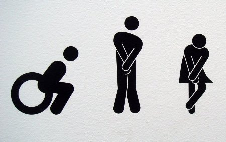
One of my favorite examples:
[Image source: The Semiotics of Toilet Signs]
A good way to tell patrons who the facility is for and more importantly to hurry it up when the toilet facilities are limited. Using images to generate empathy is often a better way of getting compliance than barking a command. Good cognitive design!
I just found a short (7 minute) YouTube video on Emotionally Intelligent Signs that provides some great examples of using Pecha Kucha to create signage that displays and encourages empathy. Check it out and then redesign a sign in your community or workplace.
