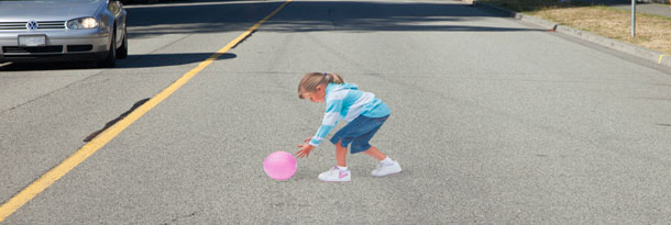
3D Image of Child in Road Slows Traffic?
 In my neighborhood you will see signs in some yards with kids in an action pose running toward the street. The signs are part of a campaign to get folks to drive more safely. The images are very life-like. I have often wondered (as a cognitive designer) what could be done to maximize their effectiveness.
Recently, I received some photos from the The Crowski in Lafayette that might begin to suggest an answer. It turns out the city of Vancouver is painting a special image of a little girl chasing a ball in the middle of the street as part of a drive safe campaign. The image is special as it looks three dimensional (3D) when you are close. For quick introduction check out, Vancouver Uses Image of Girl to Slow Drivers.
From a distance the image looks like a blob. As you approach, it slowly emerges in 3D as a little girl chasing the ball. The goal is to increase driver vigilance but not cause people to swerve or slam on their brakes. A post on Preventable.CA provides more details:
“* The 2D decal gradually appears 3D to drivers approaching the image. A risk assessment of this project shows that drivers do not mistake this image for a real girl and can see the image 100 feet away. The image does not “jump-out” at drivers and there is no “startling effect”, the road conditions on 22nd Street are very good for this project, which is precisely why this location was selected. Sight lines are perfect northbound along the road and to the cross streets. Although the community continuously grapples with unsafe driving behaviours in this particular school zone, twenty-second (22nd) Street in West Vancouver has a very good vehicle crash record.”
What do you think?
